PROPIS
BRAND DEVELOPMENT & LAUNCH
Business Brief
The brief was very simple. Make the PROPIS image stand out from competitors in the high-rise and commercial real estate sector.
Marketing STRATEGY
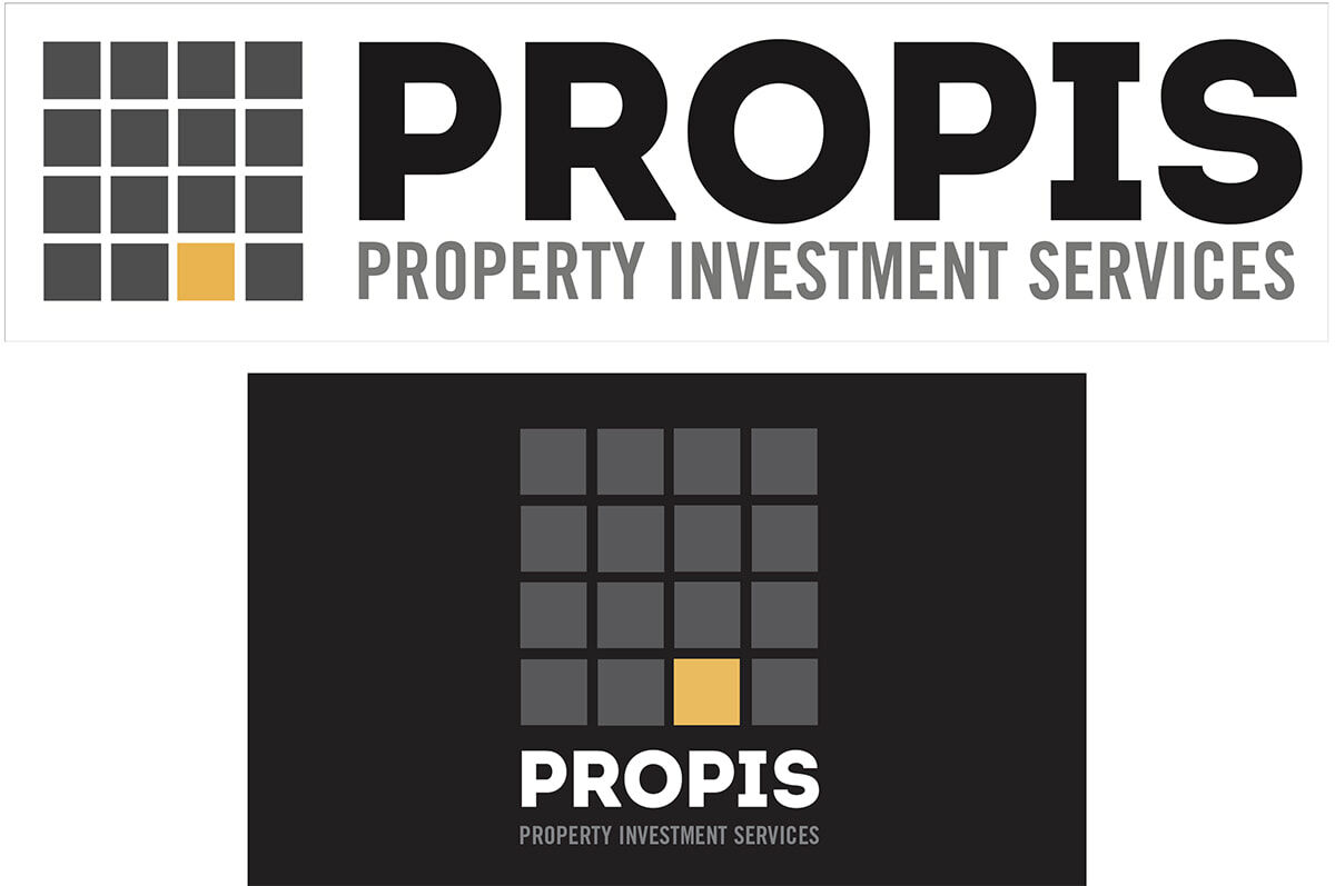
A new logo was designed with supporting billboard collateral.
CREATIVE STRATEGY
Using a colour pallet derived from a current interior design colour pallet, IQ3 delivered a totally different look from Propis competitors, and used a simple concept of a high rise building graphic with an occupied light on.


